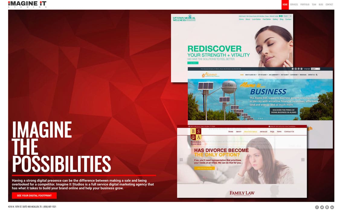
You may have noticed a short while back that we performed a major overhaul of our website. We felt that now was the time to speak out about it after working out all of the kinks and glitches that naturally come with any new site build.
We take pride in creating beautiful, functional and appealing websites. When it came time to redo our own, we knew we’d have to really step up our game. It wasn’t enough to make it appealing or functional, it also had to set the standard of what our team can achieve for future and current clients.
“The Internet is constantly evolving and we needed our website to evolve as well. As we tell our clients, “Your website should be a reflection of your company.” As a digital marketing agency, we needed our website to be a showpiece for us,” said John King, our CEO.
Creating the Perfect Reflection
“Before creating a new website, it’s obviously important to have a design first. Not doing so is like wandering into a forest without a map. This serves as a blueprint for your website build when it comes time to code it out,” said Jaime Villagomez, our web designer. “We needed a facelift that reflected and showcased the capabilities of what we could create. We’ve been creating eye-catching designs for our clients for years, and now was the time to do so for ourselves.”
Through his new design, Jaime created a brighter feel that felt polished and creative while focusing on the work we’ve accomplished. As much as it had flair and a standout presence, the design had to be approved and critiqued to reach its full potential. However, designing a masterpiece is only half the feat. Next, it needed to be handed over to our lead developer, Cesar Gonzalez.
Coding the Details
“Our tech team wanted this build to be unique, and I know that both Jaime and I developed the project from a very personal perspective. We tried to pack it with as much oomph that showcased what we could do as a company and what we could do for our clients,” said Cesar.
Take a look at our landing page again and you’ll see the bold mixes of red harmonizing with white. As you venture into the inner pages, you’ll notice the quirks of subtle motion in the background. It’s those little details that separate average websites from great ones. The overall collaboration between design and code infused a modern, sleek look that showed a mix of creative mindsets and coding magic.
A New Era is Born
“Imagine It has had about six to seven different websites over the years. Personally, I love reflecting on the changes and advancements we’ve made since then. We strive to constantly improve our work and show that we are innovative, creative and capable of handling anything that comes our way,” John concluded.
Change is a necessary component of life. It allows for growth not only on a personal level, but as a team as well. Our online evolution shows that we are adaptable and versatile, and we will continue to amplify our creativity, hard work and skills for those needing online commercial success.
Wow Your Visitors
Your website can be the difference between making a single sale a month to making dozens. It’s the first thing people see of your company and should be available 24 hours to consumers. Your business’s website should be functional and user-friendly while making a positive first impression. Visit our digital marketing agency in McAllen or call us at 956.687.1521 to start collaborating on your new website today!


