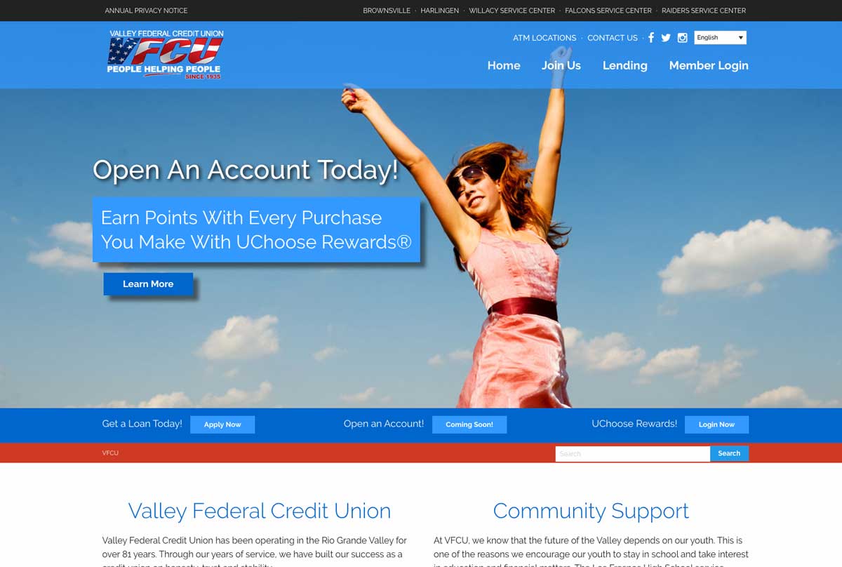
Money makes the world go round, and that world needs websites that give every visitor exactly what he or she is looking for. This was the goal when our team worked on Valley Federal Credit Union’s new website. You see, we all know finances can be hard to understand, but this doesn’t mean your financial institution’s website should be!
When working on VFCU’s new site, our team set its sights on one goal: provide a great experience for every visitor that gives them easy and fluid access to all of their needs. After all, a well-designed and functional site can be a key component to any organization’s efforts, and that’s exactly what we set out to create.
Like a Million Bucks
According to Jaime Villagomez, our web designer, the goal of the VFCU project was to update the site’s old design to the visual vibrancy of other major financial institutions from our area. The design was guided visually by VFCU’s colors, which fit perfectly with Jaime’s vision of something clean and professional.
“I really wanted a metro style for this; something sleek and easy-to-read font with just enough line-height to not overwhelm the visitor’s eyes while reading the website’s information.”
But, while the website’s colors are one of the most important aspects of its image, our team still had to provide it with its own personality.
“VFCU uses the American flag within their logo, the symbol of freedom,” Jaime continued. “It was important that we carry on the theme of ‘freedom’ throughout the entire site so that visitors can truly feel like they have free and easy access.”
Prioritizing Every Visit
At Imagine It Studios, we understand that a terrific website doesn’t just look great, but has to work great, too! It must be fully equipped to offer each visitor with what he/she needs instantly and without any complications. This, as with all of our other sites, was the goal with VFCU.
“We wanted to go with a design that emphasized ease-of-use for the customers of VFCU,” said Cesar Gonzalez, our lead web developer. “VFCU’s original site was huge and our main goal with this redesign was to condense and organize the content to ensure it was accessible and available.”
Soon after beginning work on the website, we realized Spanish content had to be a must for VFCU’s efforts. After all, Spanish is huge in our region, which means we must be able to accommodate the needs of those Spanish-speaking visitors. This led to weeks of work translating, verifying and re-structuring all of our content for a mirror Spanish site.
“Translating can get tricky, especially when working with financial terminology that doesn’t necessarily translate directly,” said Osmar Alanis, our content manager who performed the translation. “This meant that I used a meticulous process to ensure that every single sentence in the new Spanish site made complete sense.”
Let’s Get Your New Site Started
Each website we build goes through the same careful and particular procedure to ensure that our client’s wants, as well as their visitor’s needs, are met. Things were no different when planning, creating and fine-tuning the new Valley Federal Credit Union website.
At Imagine It Studios, we know how important your company’s image can be, which is why we’re always ready to help you find the best way to show it off to the world. If you’re ready to put yourself on the map, visit us in McAllen or give us a call at 956.687.1521.


